Debra Bush
Brand Designer • Visual Systems & Identity
I design durable brand systems and visual frameworks that bring clarity, consistency, and trust to complex products and evolving platforms.
Portfolio
Selected work showcasing brand systems designed to hold up under complexity, iteration, and scale.Across games, platforms, and community-driven products, I design visual frameworks that create clarity, reinforce trust, and support long-term stewardship rather than one-off executions.
Keep's Depths
Branding & Graphic Systems
Focus areas: Brand systems • Visual identity • Product-adjacent design • Long-term consistency • Scalable frameworksFrom the start of development on Keep’s Depths, we created a set of visual anchors designed to keep the project aligned internally, while also serving as the foundation for the game’s external identity.
Chapter Logos
The logo system for Keep’s Depths was designed as a stable, recognizable silhouette that could persist across chapters without fragmenting the game’s identity.Consistency in overall shape was intentional, providing a visual anchor for players and a reliable frame for internal decision-making. Within that constraint, elemental treatments and surface detail were allowed to change to reflect each chapter’s theme.In the final chapter, the silhouette is deliberately broken to signal narrative escalation and thematic rupture, reinforcing that the rules of the world have changed.
Splash Screens
These splash screens extend the logo system into full environmental compositions. While each chapter introduces new visual language, lighting, and tone, shared compositional structure and logo placement reinforce continuity across updates.
Across key surfaces, the logo was consistently positioned in the top-left corner. This placement established predictable visual hierarchy, allowed primary imagery to guide the eye rightward, and influenced internal alignment decisions within the logo itself, including text flow and structural balance.
Design Workflow & Tooling Considerations
As Keep’s Depths evolved, a range of modern tools became part of the design workflow. To maintain consistency, quality, and authorship across a small team, I defined clear, lightweight guidelines around how those tools could support the work without driving creative decisions.The goal was practical alignment, not policy enforcement.
Design Constraints
• Final creative decisions remain human-led and accountable
• Tools support exploration and iteration, not originality or judgment
• The same quality standards apply to all finished work
• Outputs are reviewed, refined, and intentionally selected
How Tools Were Used
• Explore early visual directions and variations
• Iterate on concepts where speed supported discovery
• Support workflow efficiency in non-authorial stages
What This Supported
• Consistent visual quality across releases
• Faster iteration without loss of intent
• Clear expectations for contributors
• Long-term maintainability of the design system
This approach ensured that the project’s visual identity remained cohesive, intentional, and human-directed as the scope and tooling landscape evolved.
Design Considerations Highlighted
• Clear communication beyond individual screens
• Consistent systems supporting long-term use
• Writing and structure focused on shared understanding
• Careful, intentional use of modern tools
• Decision-making grounded in clarity and accountability
Outcome & Impact
• Clear expectations shared across collaborators
• Faster iteration while maintaining visual intent
• Reduced ambiguity around quality and ownership
• A stable reference point supporting long-term consistency
TheCrewRP - Community Launcher
Brand, Product, and Community Systems DesignTheCrewRP Launcher was designed to reduce onboarding friction, improve information clarity, and strengthen community connection in a complex multiplayer ecosystem. Prior to the launcher, new and returning players relied on scattered tools, manual setup steps, and external communication channels to get started. This created unnecessary stress, confusion, and drop-off, particularly for inexperienced players.The launcher unified critical onboarding steps, surfaced timely community information, and embedded brand expression directly into a functional product surface used every day.
Problem
New players faced a high cognitive load before they could even play:
• Multiple external dependencies (Steam, FiveM, TeamSpeak)
• Unclear setup status and error states
• Important announcements missed across Discord and forums
• Community creators and streamers hard to discoverThis friction disproportionately affected:
• First-time players
• Returning players after updates
• Players unfamiliar with PC gaming ecosystemsThe result was avoidable onboarding stress, lower retention, and missed opportunities for community engagement.
Solution
TheCrewRP Launcher centralized onboarding, communication, and community visibility into a single branded experience.Key design goals:
• Make readiness and next steps immediately clear
• Reduce anxiety by surfacing errors early and plainly
• Reinforce brand identity without sacrificing usability
• Treat community members and creators as first-class citizens
Design Approach
System-first thinking
Rather than designing isolated screens, the launcher was treated as a system with repeatable states:
• Pre-launch readiness checks
• Error and recovery flows
• Content rotation and updates
• Ongoing daily useBrand as trust
Visual design, typography, and tone were consistent with TheCrewRP identity, reinforcing credibility while remaining readable and calm under stress.Clarity over cleverness
Language and layout prioritized:
• Plain explanations
• Clear calls to action
• Predictable placement of critical information
Key Features
• Automated readiness checks
Detects whether required software is installed and logged in, prompting users only when action is needed.• Guided launch flow
Handles launching dependencies in the correct order and closes automatically once connected, removing guesswork.• Centralized community news
Patch notes, announcements, and server status surfaced directly in the launcher, reducing reliance on external channels.• Featured creator spotlight
Community streamers highlighted inside the launcher, increasing visibility and reinforcing community culture.• At-a-glance server status
Live population and queue information reduces uncertainty before clicking play.
Impact
The introduction of the launcher led to measurable improvements across the community:
• Reduced onboarding stress for new and inexperienced players
• Increased player retention after updates and returns
• Improved confidence during setup and launch
• Increased viewership and discoverability for community creators
• Fewer repeated onboarding questions and support issuesBy embedding clarity and brand consistency into a functional product surface, the launcher became both a utility and a cultural touchpoint.
Artifacts
Why This Matters
TheCrewRP Launcher demonstrates how brand systems can live inside products, not just marketing surfaces. It shows how thoughtful design can:
• Reduce cognitive load
• Build trust in complex systems
• Scale community communication
• Support both users and creators simultaneouslyThis project reflects my approach to brand design: designing rules, systems, and experiences that hold up under real-world use, iteration, and growth.
Pantrii
Human-Centered Inventory & Planning System
A calm, emotionally intelligent system for managing everyday complexity, designed to reduce cognitive load and support sustainable habits over time.
Project Summary
Pantrii began as an exploration of how everyday systems can feel supportive rather than demanding. The problem wasn’t inventory tracking itself, but the friction, guilt, and cognitive overload that often accompany food planning and waste reduction.Rather than optimizing for speed or feature density, I focused on designing a pantry system that paired functional clarity with emotional tone. The goal was to create a tool that helps people make better decisions without requiring constant attention, discipline, or stress.
My Role
• Designed the brand identity, UI mockups, and core interaction flows
• Built a component system centered on calm visuals, legible hierarchy, and predictable patterns
• Mapped user flows for scanning, inventory management, and recipe-triggered planning
• Balanced functional requirements with emotional impact, ensuring every design decision served both utility and mood
Design Principles Demonstrated
• Emotionally intelligent UX for real-world, recurring tasks
• Sensitivity to cognitive load, decision fatigue, and behavioral friction
• Integration of brand, system logic, and accessibility
• Design decisions prioritizing sustainable use over novelty
Outcome & Impact
• Established a scalable foundation for a pantry and meal-planning system designed around habit formation rather than pressure
• Demonstrated early product design instincts that harmonize brand, flow, and emotional tone
• Served as a conceptual base for future explorations in emotionally aware systems and AI-assisted planning tools
Artifacts
• Early flow diagrams outlining scanning and inventory logic
• UI explorations testing hierarchy, calm color systems, and interaction affordances
• Mobile mockups demonstrating end-to-end flows from pantry state to meal decision
Rodger
Early Systems & Service Design Exploration
A systems-first exploration of real-time coordination, designed before gig platforms existed and built around clarity, accountability, and human judgment.
Project Summary
Rather than starting with screens, I mapped the underlying service logic first: how requests move through the system, how roles interact, and how breakdowns are handled when real-world conditions disrupt ideal flows.Rodger was a concept exploration in real-time coordination, designed years before gig work became app-based. The goal was to imagine a dispatch and task-tracking system that could scale without losing clarity, accountability, or human judgment.The result was a role-aware dispatch model built around communication, clear handoffs, and decision support rather than blind automation.
My Role
• Mapped the complete task lifecycle from request → assignment → reroute → resolution
• Designed system logic to handle real-world edge cases, including access failures, time overruns, and driver no-shows
• Defined and separated user-facing, driver-facing, and operations-facing responsibilities
• Sketched administrative tools for tracking service status, notifications, and expenses
• Intentionally prioritized human judgment and clarity over full automation in service handoffs
Design Principles Demonstrated
• A systems-first approach to solving real-world coordination problems
• Early fluency in role-based UX and service design
• Comfort designing for failure states, not just happy paths
• Evidence of product and systems thinking well before it was formalized in my career
Outcome & Impact
Rodger explored coordination and dispatch patterns that later became common in modern gig-economy platforms. The work demonstrates early strength in scalable coordination design, role separation, and operational clarity under uncertainty.
Artifacts
These hand-drawn logic maps and system notes predate modern design tools. They document how I reasoned through coordination frameworks, role logic, and task routing using paper sketches and flow diagrams.
• Role definitions and feature notes for the Rodger platform
• Task assignment logic balancing user needs with driver proximity
• Early flowcharts for driver notifications and task resolution routing
Selected Physical Brand Artifacts
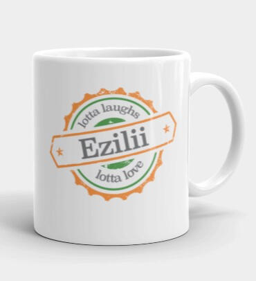
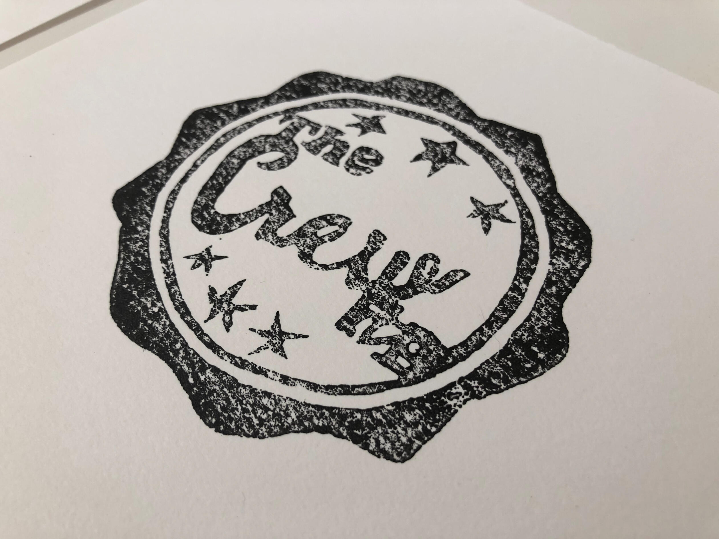
Limited-run printed artifacts exploring how brand systems translate to physical media, including texture, contrast, and reproduction constraints. These pieces were designed to test durability, legibility, and tonal consistency outside of digital environments.
Ezilii Branded MugLogo system adapted to a standardized physical product, emphasizing scale, contrast, and consistent reproduction across materials.

TheCrewRP Linocut PrintLimited-run linocut logo created as a tactile brand artifact for community engagement. Designed to explore texture, intentional imperfection, and durability while preserving the core identity.


